• Skip to primary navigation
  • Skip to main content
  • Skip to primary sidebar
  • Skip to footer
MinutesGuide.com

MinutesGuide.com

It is Not Just About WordPress

  • Home
  • About
  • Blog
    • Blogger Talk
    • Email Marketing
    • Hosting Talk
    • Plugins
    • Themes
      • Extra & Divi
    • WPbeginner
      • Guide
      • Life Hacks
      • WP Fix
    • WP Security
    • WP SEO
    • WooCommerce
  • Services
  • Reference
  • Contact
  • Start Here
You are here: Home / Themes / How to create Sticky Secondary Menu on Mobile For Divi Theme

How to create Sticky Secondary Menu on Mobile For Divi Theme

Post on March 9, 2018 | Updated on March 9, 2022 by FaizAlias Leave a Comment

How to create Sticky Secondary Menu on Mobile For Divi Theme | Divi is a flexible theme to create anything website you want. With it, you can create thousand variety of website just from single Divi Theme.

This time, we want to show you a trick how you can create a sticky menu on mobile for Divi Theme. This is because you cannot setup sticky menu on mobile directly from their setting. You just can set it sticky on the desktop version only.

On Divi, there is two header menu. Primary Menu Bar and Secondary Menu Bar.

Where is primary and secondary menu bar? Look at the picture below.

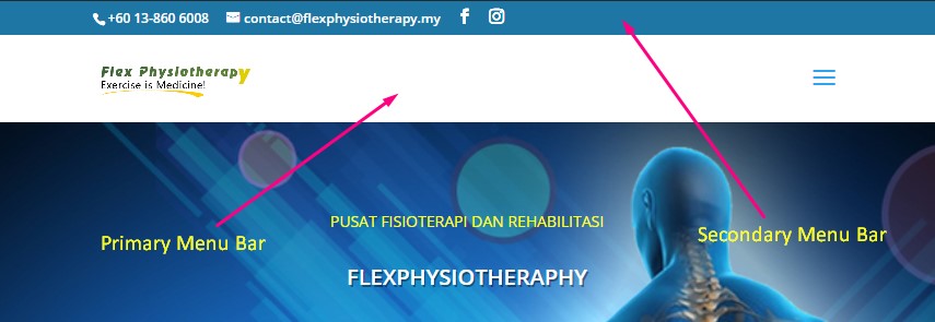
In this tutorial, we want just focus how to create sticky for secondary menu bar on Mobile for Divi theme.

Create Sticky Secondary Menu on Mobile For Divi Theme

By default, you just can create the sticky menu on the desktop only. But on mobile, it will automatically disable this function. So, how you can enable it?

Before that, please get one Divi Theme if you do not yet have it. Or you can get it here. Then install it on your WordPress. And then, follow our tutorial below to create a sticky menu on mobile.

Step 1 Make sure you have enabled Secondary Menu Bar on Divi settings.

Step 2 Copy the code below and paste it into your custom CSS.

Step 3 You can change the background with any color you want by using the color code.

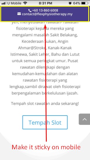
So now, test it on your mobile and see the secondary menu now is sticky on mobile.

Very easy, right?

If you need more help, please leave the comment below or if you want to get personal help please check our service.

Benefit of It

When you make it as a sticky menu on mobile, your prospect/visitors easily can contact you and this stuff can increase your sales or get more projects. So, you must consider making menu sticky on mobile for your website.

Conclusion

In this tutorial, you have learned how to create a sticky secondary menu on mobile for Divi Theme.

If you like this article, then please FOLLOW our Linkedin, Twitter, YouTube, Pinterest, and Facebook. Do not forget to check our services page to upgrade your WordPress. If you find this post has an issue with copyright, outdated, or in error, please contact us to fix it.

Related Article..

  • How to Make Collapse Menu For Divi Theme on Mobile?

Filed Under: Themes, Extra & Divi

Reader Interactions

Leave a Reply Cancel reply

Your email address will not be published. Required fields are marked *

Primary Sidebar

Follow Me

  • Facebook
  • GitHub
  • LinkedIn
  • Pinterest
  • Twitter
  • YouTube

Start With…

Start Blogging
eShop Guide
WP Guide
WP Security

Categories

Footer

About MinutesGuide

Was founded in October 2017 by FaizAlias. The main goal of this site is to provide quality tips, tricks, hacks in easy way that you can learn it just in minutes.

Highlight Service

Ninja Tables Pro Installation And Setting
CSS Hero Plugin Installation And Setting
Divi Theme Installation & Settings
Build Complete eCommerce Site

Quicklink

Home
Services
Contact
Blog

Copyright © 2022 · Designed by SM Creative Studio | Hosted by Cloudways DMCA.com Protection Status

  • Privacy Policy
  • Terms of Use