
Top Five Most Effective Banner Size for Blog | Creating an attractive blog is about much more than writing high-quality content. Visual elements also play an important role in improving user experience, strengthening branding, and increasing engagement. One of the most overlooked design elements is choosing the right banner size for blog layouts.
A banner serves multiple purposes. It can highlight promotions, display advertisements, showcase featured content, introduce your brand, or encourage visitors to subscribe to your newsletter. However, even the most beautifully designed banner can perform poorly if it uses the wrong dimensions.
Selecting the correct banner size ensures that your graphics appear sharp, load quickly, and display properly across desktop, tablet, and mobile devices. It also helps prevent layout issues that can negatively affect your website's professionalism.
In this guide, you will discover the top five most effective banner size for blog websites, understand where each banner should be placed, learn the advantages and disadvantages of each size, and find practical tips for designing banners that improve both user experience and search engine optimization.
Table of Contents
Top Five Most Effective Banner Size for Blog
Why Banner Size Matters for a Blog
Choosing the correct banner dimensions is more important than many bloggers realize. Banner size influences not only the appearance of your website but also its usability and performance.
A properly sized banner helps maintain a clean layout that looks organized and professional. Visitors are more likely to trust a website that appears polished and easy to navigate.
The correct banner dimensions also improve page loading speed. Oversized images often increase page weight, causing slower loading times that may frustrate visitors and increase bounce rates.
Additionally, responsive banner sizes ensure that your website looks consistent across different screen sizes. Since a large percentage of users browse the internet using smartphones, responsive design has become essential.
Some of the major benefits of choosing the correct banner size include:
- Better visual appearance
- Improved website loading speed
- Higher user engagement
- Better advertising performance
- Enhanced mobile responsiveness
- Stronger brand recognition
- Improved SEO performance through faster pages
Factors to Consider Before Choosing a Banner Size
Before selecting a banner size, it is important to evaluate several factors that affect how well your banner performs.
Website Layout
Different blog themes allocate different amounts of space for banners. A full-width layout can accommodate large horizontal banners, while sidebar layouts require narrower vertical banners.
Mobile Compatibility
More than half of internet users access websites through smartphones. Your banner should resize smoothly without losing image quality or cutting off important content.
Purpose of the Banner
Not every banner has the same objective.
Some banners are designed to:
- Display advertisements
- Promote products
- Highlight new articles
- Collect email subscribers
- Build brand awareness
The intended purpose often determines the ideal dimensions.
File Size
Large image files can significantly slow down a website.
Compress banner images while maintaining high quality to achieve the best balance between appearance and speed.
Readability
A banner should never become cluttered.
Leave sufficient white space around text and buttons so visitors can immediately understand the message.
Top Five Most Effective Banner Size for Blog
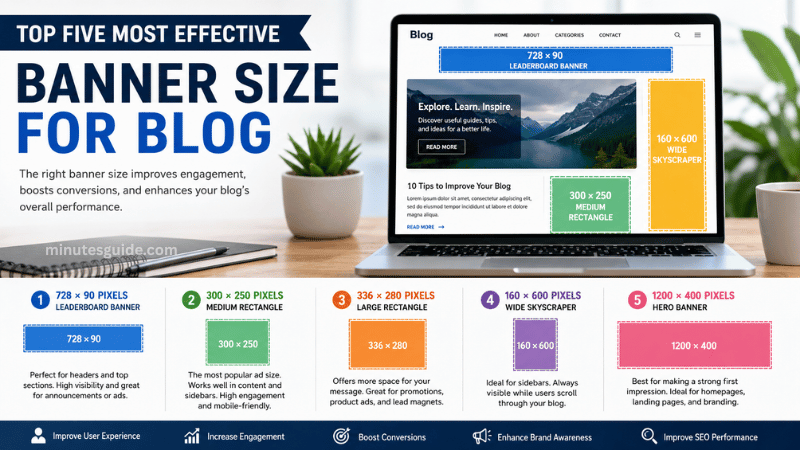
Below are the five banner sizes that consistently perform well across most blog websites.
1. 728 × 90 Pixels (Leaderboard Banner)

The 728 × 90 banner, commonly called the Leaderboard, is one of the most widely used banner formats on blogs.
It is designed for horizontal placement and typically appears at the top of the website, directly below the navigation menu, or between article sections.
This banner is ideal for displaying advertisements, announcing promotions, or showcasing featured content.
Best Placement
- Header section
- Below navigation menu
- Above blog posts
- Between article paragraphs
Advantages
| Pros | Cons |
|---|---|
| Highly visible | Limited space for detailed content |
| Excellent for desktop visitors | Not ideal for mobile devices |
| Common advertising standard | Requires responsive alternative for smartphones |
| Supports strong branding | Wide format limits design flexibility |
Recommended Use
Use this banner for:
- Website announcements
- Affiliate promotions
- Sponsored advertisements
- Featured articles
- Seasonal campaigns
2. 300 × 250 Pixels (Medium Rectangle)
The 300 × 250 Medium Rectangle is arguably the most versatile banner size available.
It performs exceptionally well because it fits naturally within blog content without disrupting the reading experience.
Many advertising platforms also prioritize this format because of its consistently high click-through rates.
Best Placement
- Inside articles
- Sidebar
- End of blog posts
- Product recommendations
Advantages
| Pros | Cons |
|---|---|
| Excellent engagement | Smaller visual impact |
| Mobile-friendly | Limited room for extensive messaging |
| Supports both ads and promotions | Can blend into content if poorly designed |
| High advertising compatibility | Requires strong visuals to attract attention |
Recommended Use
Perfect for:
- Affiliate products
- Google Ads
- Newsletter sign-up forms
- Digital product promotions
- Course advertisements
3. 336 × 280 Pixels (Large Rectangle)
The Large Rectangle is very similar to the Medium Rectangle but offers additional design space.
The larger dimensions allow for larger text, stronger call-to-action buttons, and more attractive graphics.
Many bloggers use this format when they want promotional content to stand out without occupying excessive screen space.
Best Placement
- Within long-form articles
- Homepage content sections
- Product review pages
Advantages
| Pros | Cons |
|---|---|
| Larger content area | Slightly heavier image size |
| Excellent conversion potential | Requires responsive adjustments |
| More space for branding | Less suitable for narrow sidebars |
| Highly visible | May interrupt content if overused |
Recommended Use
Ideal for:
- Product launches
- Lead magnets
- Service promotions
- Online courses
- Software recommendations
4. 160 × 600 Pixels (Wide Skyscraper)

The Wide Skyscraper is designed specifically for sidebars.
Unlike horizontal banners, this vertical format remains visible as visitors scroll through long articles, making it highly effective for continuous brand exposure.
Many professional blogs use this size for affiliate banners and long-term advertising campaigns.
Best Placement
- Sidebar
- Sticky sidebar
- Resource pages
Advantages
| Pros | Cons |
|---|---|
| Constant visibility | Poor mobile compatibility |
| Excellent for affiliate marketing | Limited width |
| Great for branding | Requires responsive alternatives |
| Suitable for long pages | Less effective on narrow layouts |
Recommended Use
Use this banner for:
- Affiliate products
- Sponsor logos
- Brand awareness campaigns
- Premium memberships
- Course promotions
5. 1200 × 400 Pixels (Hero Banner)
The Hero Banner has become increasingly popular because modern blogs often feature large header images.
Unlike traditional advertising banners, this banner focuses on storytelling and branding.
A Hero Banner usually spans the full width of the page and immediately captures visitor attention.
Best Placement
- Homepage
- Landing pages
- Category pages
- Featured content pages
Advantages
| Pros | Cons |
|---|---|
| Creates strong first impressions | Larger file size |
| Excellent branding opportunities | Requires high-quality images |
| Ideal for storytelling | Needs responsive optimization |
| Perfect for call-to-action sections | More design effort required |
Recommended Use
Suitable for:
- Homepage introductions
- New product launches
- Promotional campaigns
- Brand messaging
- Portfolio showcases
Comparison of the Top Five Banner Sizes
| Banner Size | Primary Use | Best Location | Mobile Friendly |
|---|---|---|---|
| 728 × 90 | Header advertising | Top of page | Moderate |
| 300 × 250 | Content advertising | Articles and sidebar | Excellent |
| 336 × 280 | Promotions | Within content | Good |
| 160 × 600 | Sidebar advertising | Sidebar | Limited |
| 1200 × 400 | Hero image | Homepage | Excellent when responsive |
How to Choose the Best Banner Size for Your Blog
There is no universal banner size that works for every blog. The most effective choice depends on your website's design, audience, and objectives.
If your goal is to maximize advertising revenue, the 300 × 250 Medium Rectangle is often the best option. It is widely supported by advertising networks, integrates naturally into content, and performs well on both desktop and mobile devices.
If your focus is on branding, a 1200 × 400 Hero Banner provides ample space to create a memorable visual identity. This format is particularly effective on homepages and landing pages where first impressions matter.
Blogs that rely heavily on affiliate marketing can benefit from the 160 × 600 Wide Skyscraper. Positioned in a sticky sidebar, it remains visible as visitors scroll, offering consistent exposure for affiliate products or sponsor messages.
For websites that regularly announce promotions or featured content, the 728 × 90 Leaderboard remains a reliable choice. It sits prominently near the top of the page, making it easy for visitors to notice without overwhelming the overall layout.
If you frequently publish product reviews or educational content, the 336 × 280 Large Rectangle gives you extra room for persuasive copy, product visuals, and call-to-action buttons.
Ultimately, testing different placements and dimensions is the most effective way to identify what resonates with your audience. Monitor metrics such as click-through rate, engagement time, and conversion rate to refine your strategy over time.
Best Practices for Designing Blog Banners
Selecting the right dimensions is only part of the equation. Effective banner design also depends on how the content is presented.
Keep your message concise. Visitors should understand the purpose of the banner within a few seconds. Avoid long paragraphs or excessive details that can make the design appear cluttered.
Use high-resolution images that remain sharp across all devices. Blurry or pixelated visuals can reduce trust and make your website look unprofessional.
Maintain consistent branding by using the same color palette, typography, and logo placement throughout your banners. Consistency helps reinforce your brand identity and creates a cohesive browsing experience.
Include a clear call-to-action (CTA). Whether you want readers to subscribe, download a guide, or explore a product, make the next step obvious with action-oriented text such as "Learn More," "Get Started," or "Read the Guide."
Optimize image files before uploading them. Modern formats like WebP can significantly reduce file size without sacrificing visual quality, helping your pages load faster.
Design banners with responsive behavior in mind. Important text and graphics should remain visible even when the banner scales down on smaller screens.
Finally, avoid placing too many banners on a single page. Excessive advertising can distract readers, slow down page performance, and negatively impact the overall user experience.
Common Mistakes to Avoid
Many bloggers unintentionally reduce the effectiveness of their banners by making avoidable design and placement errors.
One common mistake is using images that are much larger than necessary. Oversized files increase loading times, which can frustrate visitors and hurt search engine rankings.
Another issue is overcrowding banners with text. A banner should communicate one clear message rather than attempting to present multiple offers at once.
Poor color contrast is also a frequent problem. Text should stand out clearly against the background to ensure readability for all users.
Some bloggers neglect mobile optimization, assuming that a banner designed for desktop will automatically work well on smartphones. Without responsive adjustments, important content may become cropped or unreadable.
Inconsistent branding is another mistake. Using different fonts, colors, or visual styles across banners can make a website appear less professional and reduce brand recognition.
Finally, placing banners in intrusive locations can disrupt the reading experience. Pop-ups or oversized banners that obscure content may increase bounce rates instead of improving engagement.
Conclusion
Choosing the right banner size for blog websites is an important part of creating a professional, user-friendly, and high-performing online presence. Well-sized banners improve visual appeal, support responsive design, enhance branding, and contribute to better engagement without compromising page speed.
Among the many available options, the 728 × 90 Leaderboard, 300 × 250 Medium Rectangle, 336 × 280 Large Rectangle, 160 × 600 Wide Skyscraper, and 1200 × 400 Hero Banner stand out as the most effective choices for a wide range of blogging goals. Each serves a distinct purpose, from displaying advertisements and affiliate offers to showcasing featured content and strengthening your brand identity.
Rather than relying on a single banner format, consider combining multiple sizes strategically across your blog. Use a Hero Banner to create a strong first impression, place Medium or Large Rectangles within content for promotions, add a Leaderboard for announcements, and position a Wide Skyscraper in the sidebar for continuous visibility. By pairing the appropriate banner size with thoughtful design, responsive optimization, and regular performance testing, you can create a blog that is visually engaging, easy to navigate, and better equipped to achieve your marketing and content objectives.
Soalan Lazim
What is the best banner size for blog websites?
There is no single banner size that is perfect for every blog. However, the 300 × 250 Medium Rectangle is widely considered one of the most effective options because it works well on both desktop and mobile devices. It also integrates naturally within blog content and is supported by most advertising networks.
What is the standard banner size for blog headers?
A 728 × 90 Leaderboard is one of the most common banner sizes used in blog headers. It provides excellent visibility for announcements, advertisements, and promotional campaigns. For modern websites with full-width layouts, a 1200 × 400 Hero Banner is also a popular choice.
Which banner size performs best for Google AdSense?
The 300 × 250 Medium Rectangle consistently ranks among the highest-performing banner sizes for Google AdSense. It generally attracts higher click-through rates because it can be placed within article content where visitors naturally focus their attention.
Is a Hero Banner better than a Leaderboard Banner?
Both banner types serve different purposes. A Hero Banner is designed for branding, storytelling, and creating a strong first impression, while a Leaderboard Banner is primarily intended for advertisements and announcements. Many successful blogs use both to maximize visual impact and user engagement.
What is the best banner size for mobile-friendly blogs?
Responsive banners are the best choice for mobile-friendly websites. Among the standard banner sizes, the 300 × 250 Medium Rectangle performs exceptionally well because it adapts effectively to smaller screens without compromising readability or user experience.
How can I improve banner loading speed?
You can improve loading speed by compressing images before uploading them, using modern image formats such as WebP, minimizing unnecessary design elements, and ensuring that the banner dimensions match the space allocated on your website. Optimized banners help improve page speed and overall user satisfaction.
How many banners should a blog page have?
There is no fixed limit, but it is generally recommended to avoid overcrowding a page with banners. Too many banners can distract readers, slow down page loading times, and reduce the overall browsing experience. Placing banners strategically is usually more effective than displaying a large number of advertisements.
Should every banner include a call-to-action (CTA)?
If the banner is intended to generate clicks, sales, subscriptions, or leads, including a clear call-to-action is highly recommended. Simple phrases such as "Learn More," "Get Started," or "Read Now" encourage visitors to take the desired action.
Can I use different banner sizes on the same blog?
Yes. Many professional blogs use multiple banner sizes throughout their websites. For example, a Hero Banner may appear on the homepage, a Leaderboard Banner in the header, Medium Rectangle banners within articles, and a Wide Skyscraper in the sidebar. Using different sizes strategically allows each banner to serve a specific purpose.
Does banner size affect SEO?
Banner size can indirectly affect SEO. Large, unoptimized images may slow down page loading speed, which can negatively impact user experience and search engine rankings. Choosing appropriate banner dimensions and optimizing image files helps improve website performance and supports better SEO results.
Rujukan
- Top 5 Web Banner Sizes - marinaduque.com
- The Top 10 Most Common Banner Ads Dimensions for 2026 - juiceddigital.com